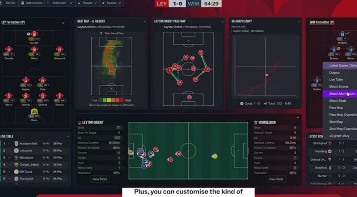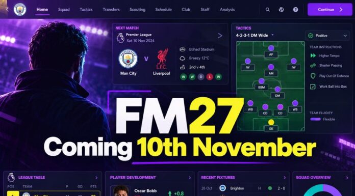





Recently, SI released a deep dive on FM27 on the games blog, complete with videos and screenshots. In today’s article, we will look at our main takeaways from the information revealed by FM’s creators.
A change in the user interface
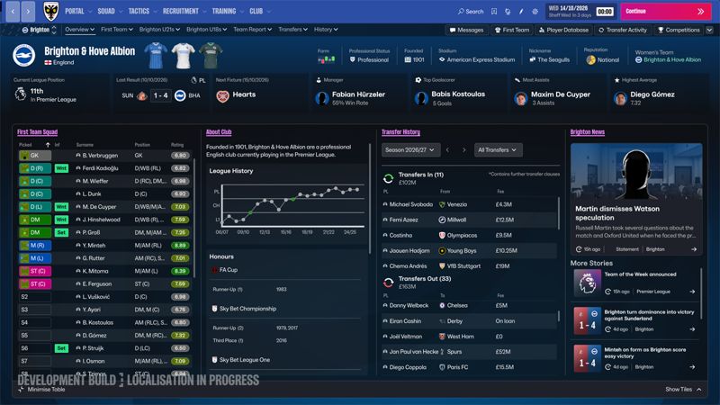
The first deep dive focuses mainly on the new UI for FM27. One of the big changes from FM24 to FM26 was the UI. Let’s just say it wasn’t massively popular with the majority of die-hard FM players. Some even claimed that it put them off playing the game.
For me, I don’t love the FM26 UI because it is clunky and takes more clicks to do everything. That seems to be the most common complaint amongst players of the series.
After playing FM26, I am now accustomed to the clunky UI. However, it’s a matter of putting up with it to play the game. That shouldn’t be the case when it’s the main or even only game you play in your spare time.
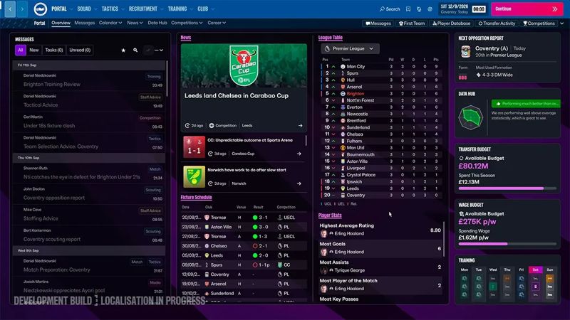
Thankfully, the reveal is an encouraging one when it comes to the first images of the UI. It seems the tiles, once considered a major issue for navigation and design, have been adjusted. There seem to be fewer tiles on the home page, but with more pertinent information on them, which is always a positive.
Based on the limited video and screenshots of FM27, it looks like SI has decided to take a leaf out of FM24’s book for navigation. It is not exactly like FM24, but the new screens seem inspired by the game, although the left navigation sidebar is still basically at the top.
The design of FM27 looks to have attempted to use FM24 as its template, but used a fresher design in order to attempt to move forward, and dare I say, encourage old players to return to the game.
One thing I noticed from the reveal is that when a scout report appears on your portal, the full report appears with all the information without having to click anything else. This has been a big bugbear for me with FM26. It’s a small issue, but it saves another click.
A greater chance to customise the game
One reason FM26 received criticism was its lack of UI customisation. In previous editions, it wasn’t difficult to use modder-made skins.
You could use custom skins on FM26, but they were no longer available via a drop-down menu. To use a custom skin, you had to edit the code. This wasn’t ideal, as it felt like another complication added to a game that was already frustratingly time-consuming to navigate.
Also, the fact that we can adjust which tiles appear on the right side of the screen, as well as the order of your bookmarks, is a step in the right direction.
SI also bringing scaling back is a positive. Some people have scope for more information on the screen, so the three options of Default, Condensed and Detailed give players more chance to adapt the settings to fit their preferences and circumstances.
While those are welcome features, it is hard to judge the development of FM27’s UI from the limited information we have got from these short deep-dive presentations so far.
Does it look better than FM26?
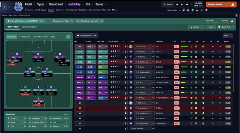
As I have said a few times in the article, it is hard to make a judgement on the FM27 UI with so little information. It is also hard to judge, as this isn’t necessarily the final UI for the game.
This is just a developmental version, so it’s not set in stone, although it is unlikely to stray far from the version we have been shown if it’s been used in the deep dive presentation.
All I can say right now is that, based on what we have seen in the UI deep dive, there are some extremely encouraging signs that FM27 will be far easier to navigate than its clunky predecessor.
It seems SI has taken on board some of the feedback from players and, hopefully, testers, and has come up with a user interface that is more intuitive than FM26.
As I have repeated several times when criticising SI for FM26, it was never going to be easy to virtually create a new game from scratch on a new game engine.
There was always going to be teething problems. Unfortunately, it seems the teething problems with FM26 have seen many former FM players turn their backs on the game.
Will FM27 be enough to draw back in some of the lost fanbase? Only time will tell, but from what I have seen, I will certainly enjoy FM27 more than FM26.
Have you been impressed by the deep dive reveal of the new user interface for FM27? Let us know via our socials.