So here I am in Ceadir Lunga, down in the south of Moldova, with a remit to approach the management of a football club the way that an engineer would.
Engineers like data. In particular, they like quantitative data. And most of them like data to be displayed visually. A good dashboard is the kind of thing that turns engineers on.
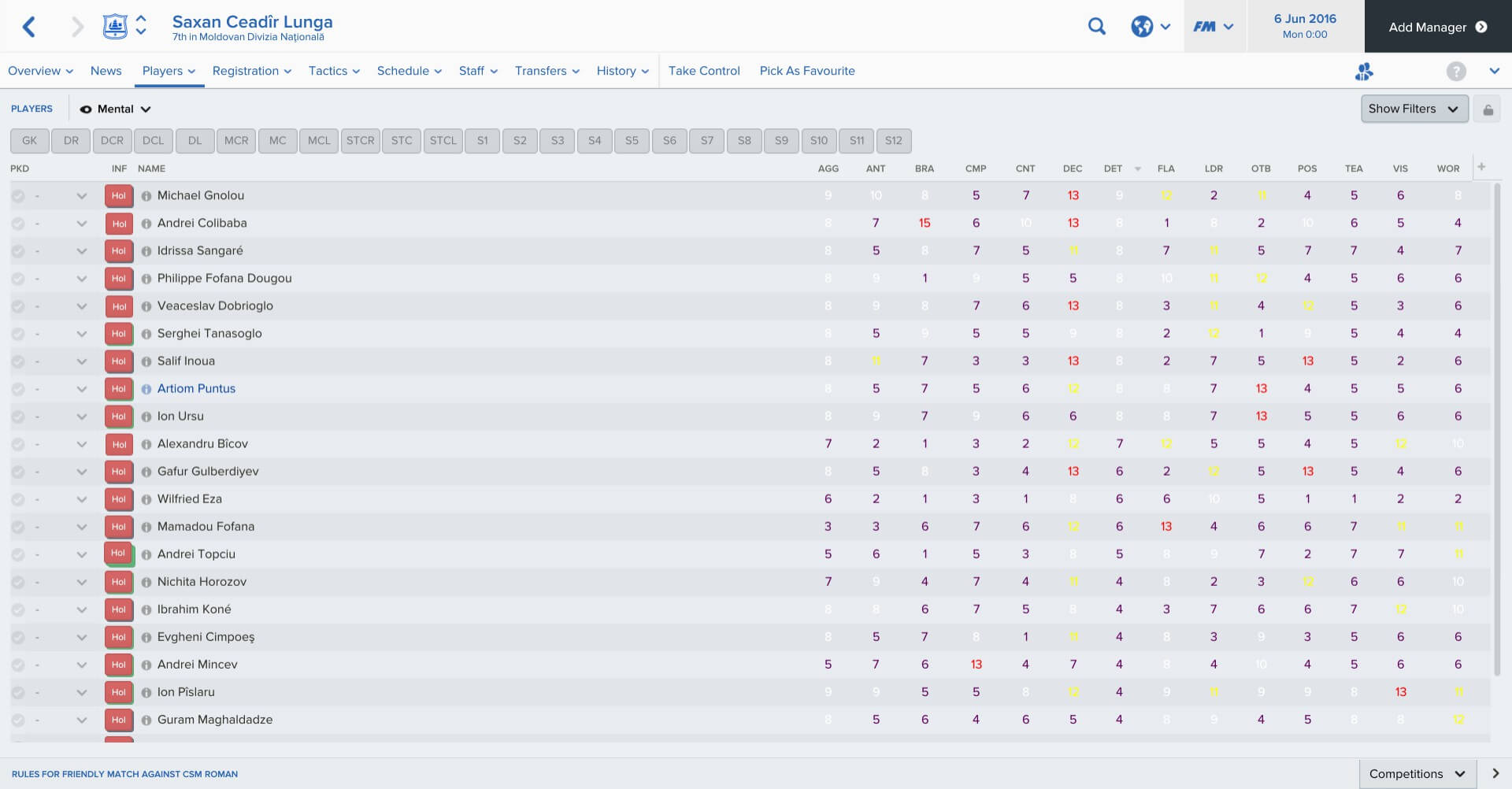
Before I even meet the players I want to analyse their attributes on the database. And to help me do that, I want to use colour. Setting up parameters for displaying data using colour takes only a minute or two and will then help me, throughout my time at FC Saxan, with a myriad of decisions. I call that an efficient use of time.
How one sets those parameters will depend on the quality of the league. So far I’ve seen only one match in the Moldovan top flight. It indicated that the standard’s not great. Not the worst I’ve ever seen — I grew up a Bromley Town fan, after all — but not great.
So I set the parameters as follows:
0-7 (out of 20): purple
8-10 (‘average’): white
11-12 (‘good’): yellow
13+ (‘excellent’): red
I spent a while deciding on the colours themselves.
For poor attributes (0-7) you want a colour that stands out, but isn’t attractive. I tried blue first, but I found I liked the colour — with the consequence that when I first looked at a poor player’s profile, I felt attracted towards it. Even though I knew that blue = poor, it made me somehow, subconsciously, take to the player. That’s dangerous.
Purple was OK though — different from the other colours but, to me at least, uninviting.
Yellow and, especially, red are colours that jump out of the screen at you.
With the parameters set, I turned to the squad’s mental attributes. You’ll see there’s a lot of purple.